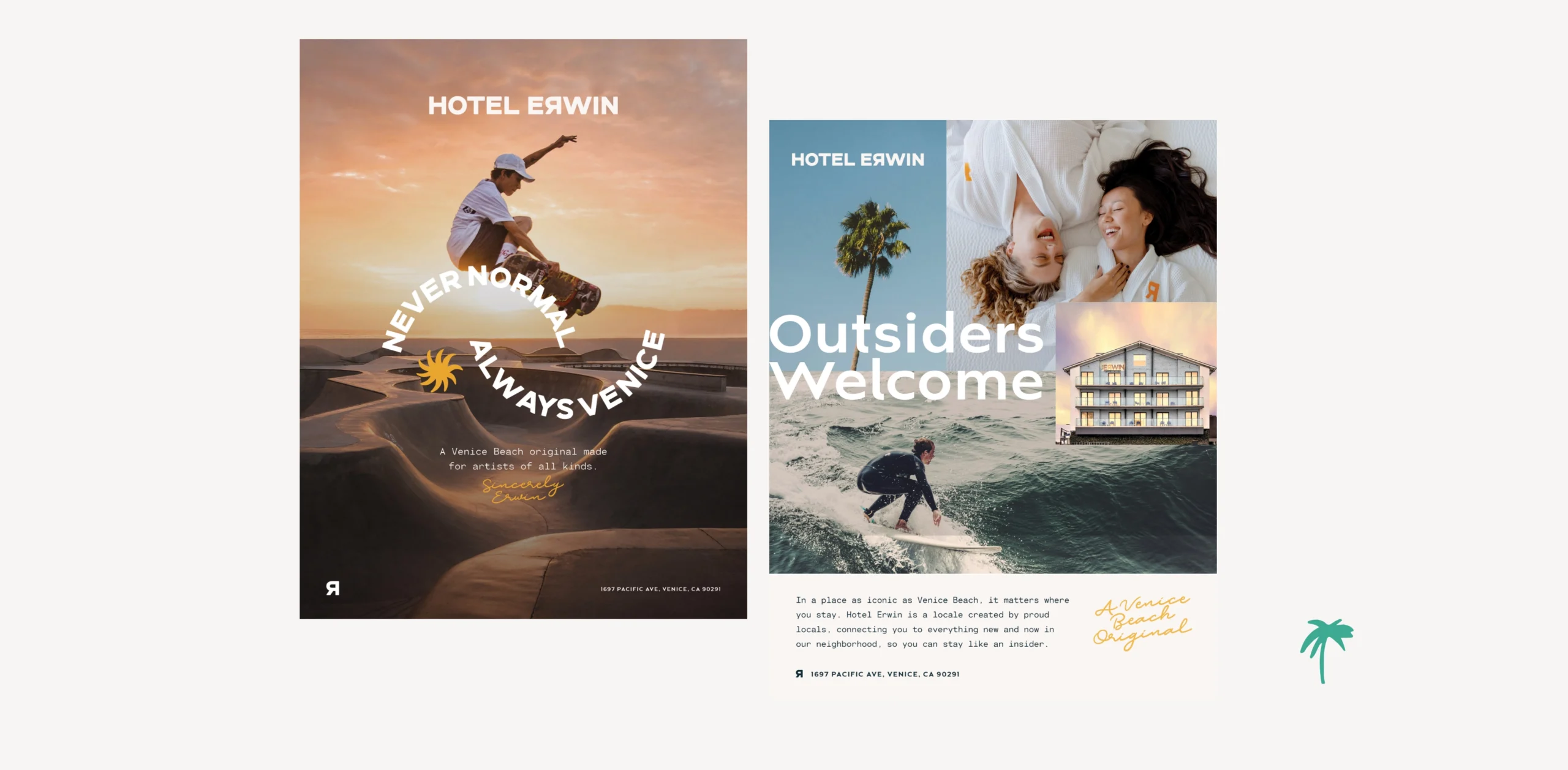
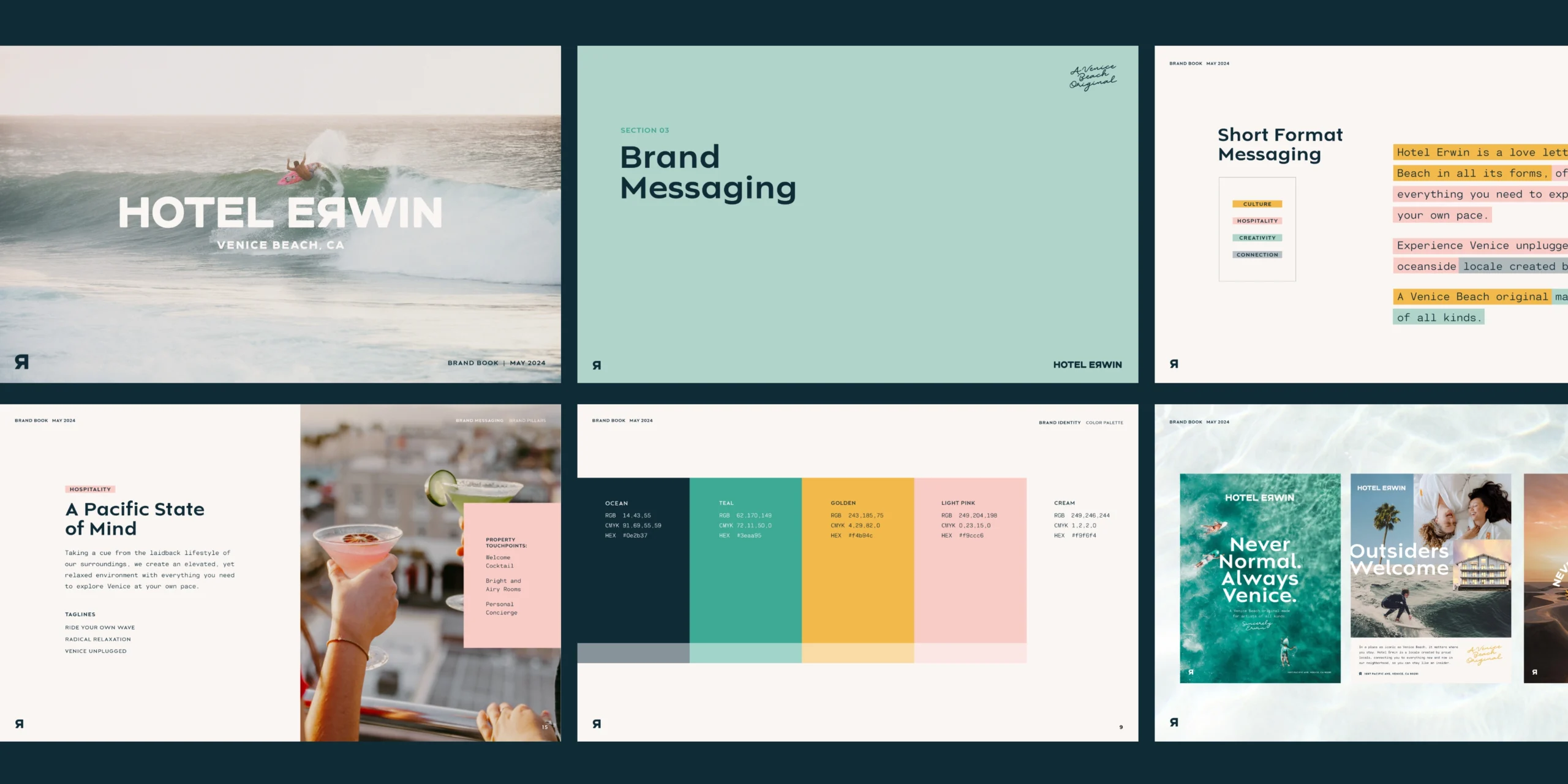
Hotel Erwin

When Venice Beach icon Hotel Erwin needed a refreshed identity to match its rebellious spirit and local roots, they turned to Vacancy to bring the vision to life. With a history as colorful as the neighborhood it calls home, the hotel was already a cultural landmark, but its brand needed sharper definition, stronger storytelling, and a more intentional guest experience. We delivered a full brand identity, messaging system, and set of brand guidelines built to express Erwin’s unapologetically local point of view, loud personality, and laid-back California energy.

Brand Positioning

Brand Identity

Brand Messaging

Brand Guidelines

Brand Identity

We developed a visual system that’s as bold and irreverent as the property itself. The logo is confident and minimal, offering flexibility while anchoring the brand. A vibrant color palette pulls inspiration from Venice street art, California sunsets, and vintage surf culture. Typography is expressive but grounded, creating hierarchy and energy across signage, menus, digital, and print. The result is a visual identity that feels like Venice: artistic, unexpected, and sun-drenched with attitude.

Brand Messaging

The messaging was crafted to flex across guest-facing copy, digital campaigns, in-room experiences, and B2B marketing. From casual headlines to emotional storylines, every word reinforces the hotel’s brand positioning: Venice Beach’s original landmark for artists of all kinds.

Brand Guidelines

To ensure the brand is executed consistently, confidently, and creatively, we developed a detailed brand book. It includes specifications for logo usage, typography, color, photography, tone of voice, and visual applications. These tools empower Hotel Erwin’s internal team and external partners to express the brand across platforms without losing its edge.

VIEW SIMILAR PROJECTS