

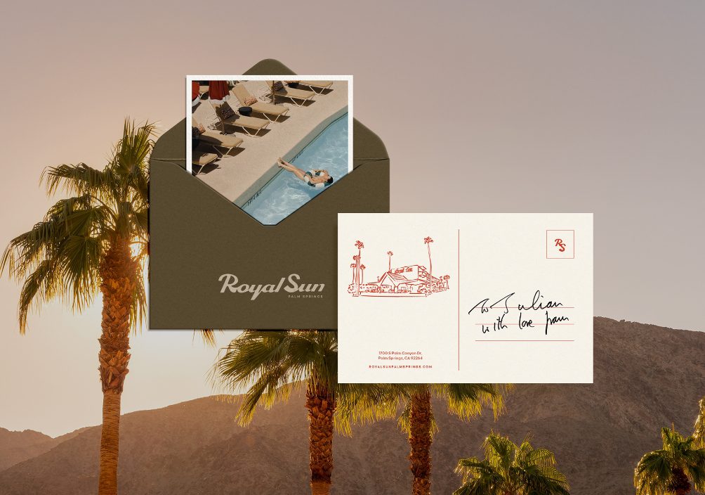
Royal Sun Palm Springs
A new identity for a Palm Springs hideaway in the sun.
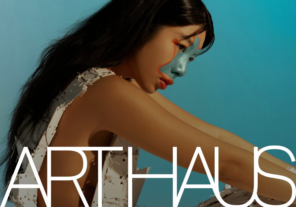
Art Haus
Creating a home for all creative kind.
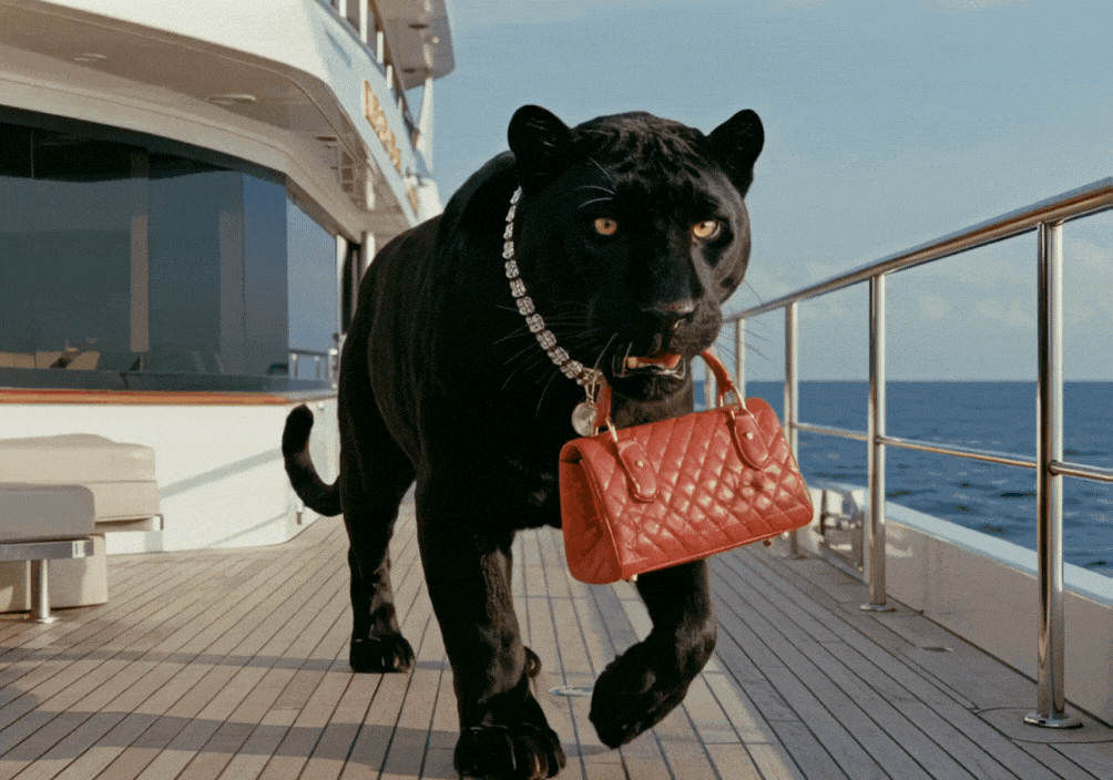
Moravia Has More Fun
A larger-than-life campaign for yachting’s wild side.
A new identity for a Palm Springs hideaway in the sun.
Creating a home for all creative kind.
A larger-than-life campaign for yachting’s wild side.